Making Seamless The Transfer Processes
TransferWise rebranded as Wise in February 2021 to reflect the broadening nature of their services. It led to several consequences, especially in the design processes according to a customer review: “What looks to be simple is never simple.” New strategies and design changes made the experience slow and complex to use. I was part of UX research to redesign the Wise transfer experience.
All information in the case study is my own and does not necessarily reflect the views of Wise.
Between 2018 and 2023, Wise reached 16 million customers — but reviews said it had lost its simplicity.
Between 2018 and 2023, Wise saw its customer base increase rapidly, reaching a milestone of 16 million customers in March 2023. Wise stands out from some of its competitors by not marking up exchange rates to fatten profits. The company boasts that it avoids “unfair” exchange rates charged by banks. However, according to customer reviews, the company has lost its uniqueness and is no longer aligning with its original promises.
Make it seamless for users to transfer. The original premise was simple — transfer money and receive — but we weren't trying to revert to a simple past. The ambition was a strong foundation that embraced a rapidly evolving business and a more diverse user base.
- Make it fast and easy to use for everyone, everywhere.
- Give users more fairness over transfer time and money.
- Create a platform for innovation and deeper engagement.
I worked on the UX strategy to focus in-depth on Wise's transfer processes — collecting research data and analysing strategies and solutions. I collaborated with the product design lead, who specialises in payments, to better understand the processes and gain experience in the financial, banking, and payments fields.
During the research I used the following processes: collecting data, problem framing, product experience ladder, user journey, UX audit, ideation, value/effort matrix, qualitative data, user flow, wireframes, prototype.
At the outset of the project I didn't have a clear mission or specific goals for the transfer experience. Without pre-existing insights, I collected data from interviews, social media monitoring, secondary sources, observations, qualitative data, and user testing to explore how customers transfer their money.
The simple transfer flow was anything but simple.
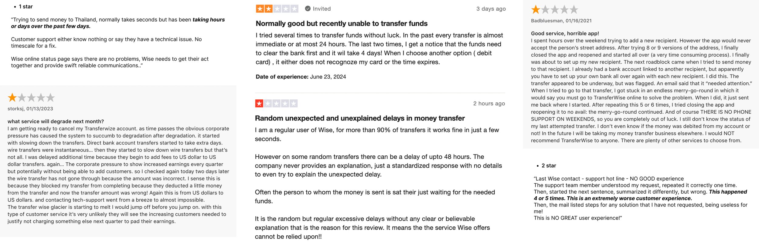
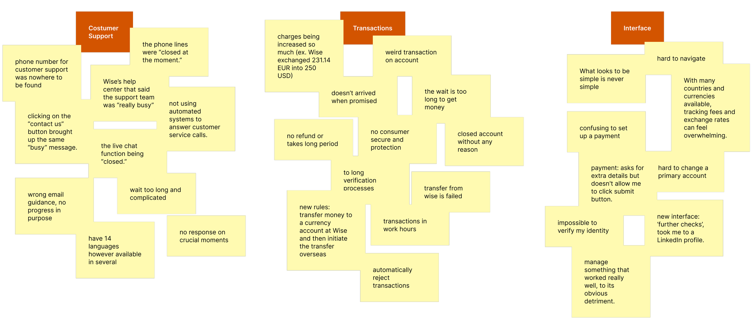
One of the open sources I used is review websites, which provide users' reviews, emotions, and the issues they face with a product. The main topics: customer support, transfer processes, and interface design.
I was surprised by the issues I found. From a simple transfer flow, users were getting lost in the process.
Choosing the right problem to solve.
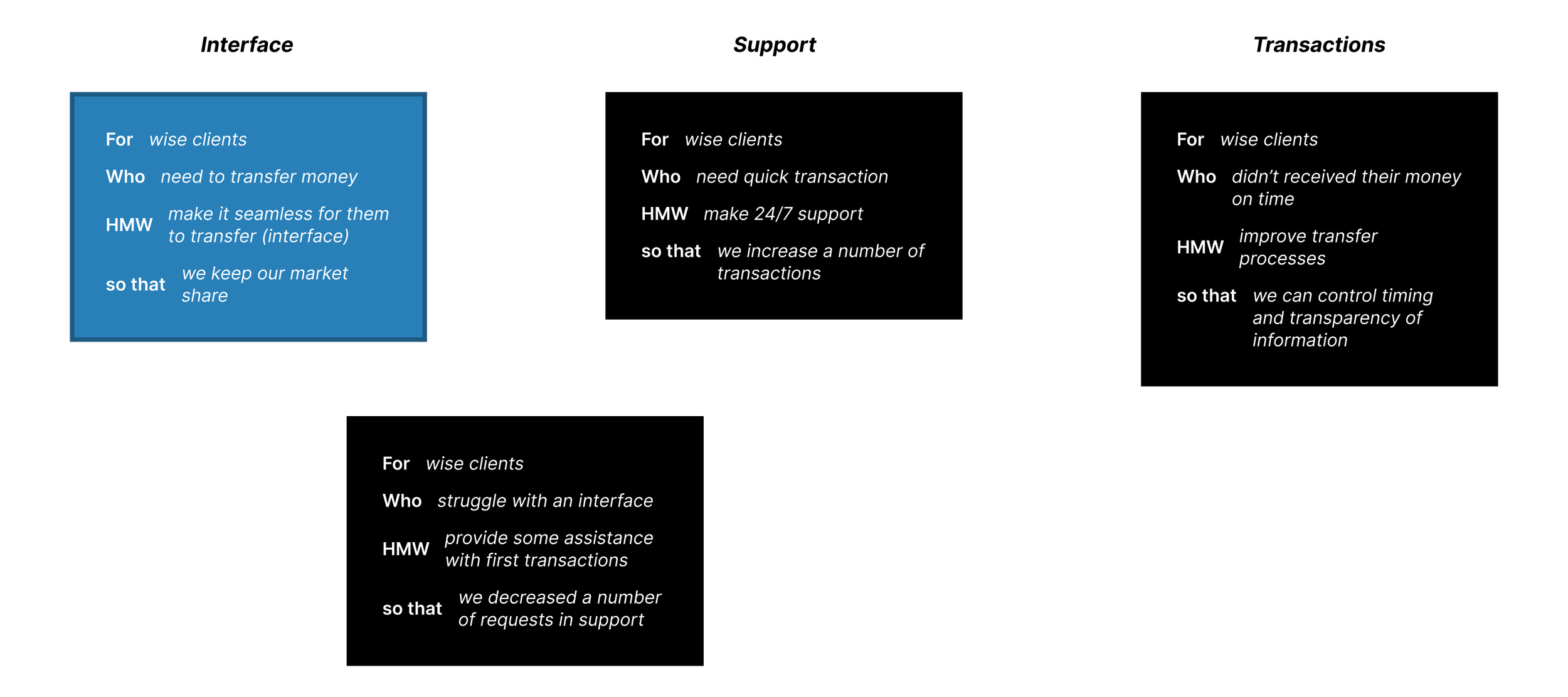
Before I could jump into designing, it was important to define all possible options to choose the right problem framing. After considering various options, I chose the most valued one:
“For Wise clients who need to transfer money, how might we make it seamless for them to transfer, so that we keep our market share.”
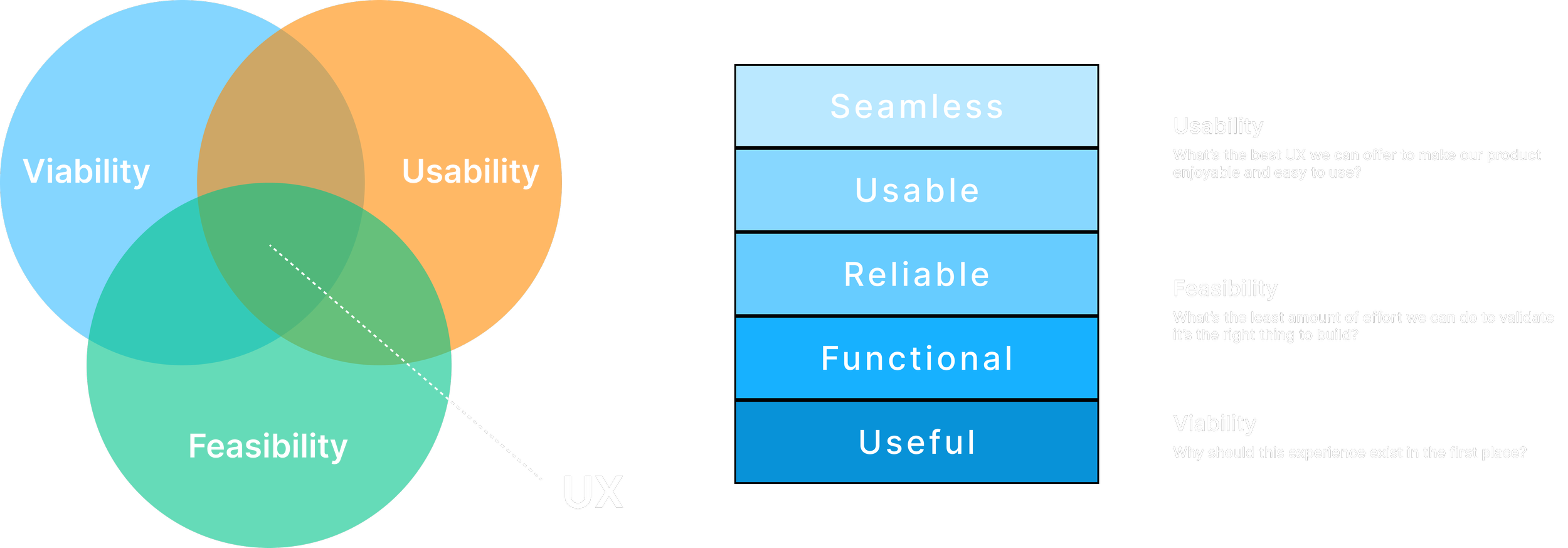
To achieve the goal of “making it seamless,” I used the Venn Diagram and Product Experience Ladder. This approach focuses on three main UX-related values: viability, usability, and feasibility.
The Product Experience Ladder is akin to Maslow's hierarchy of needs, progressing from Useful to Seamless. Achieving seamlessness requires the product to pass through all stages — starting from being useful, before becoming usable.
What does success look like?
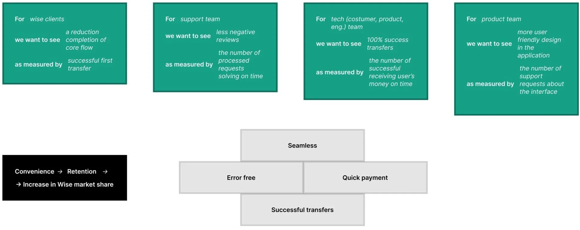
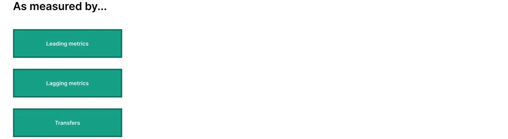
So, what happens when I solve this problem? I used the structure: For (our user type), we want to see… as measured by…
“For Wise clients we want to see a reduction in completion of core flow, as measured by successful first transfer.”
From registering a new user to completing their first transfer.
In the main research I focused in-depth on all the core steps from registering a new user to completing their first transfer. The user journey is one of the best methods that fit the case study.
Wise has significant shortcomings in its support services — users often confuse payment and transfer issues, which leads them to seek support.
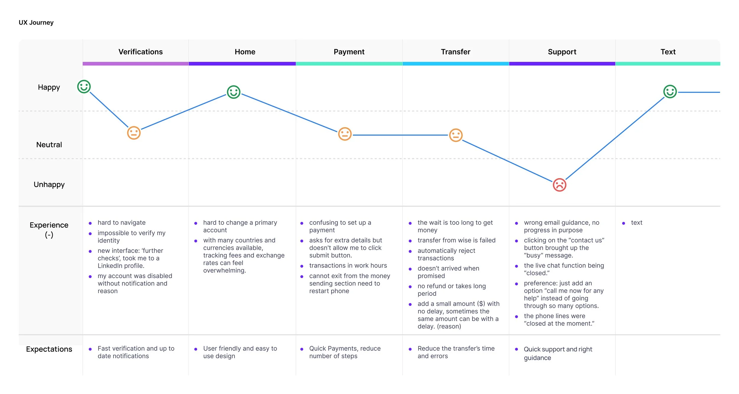
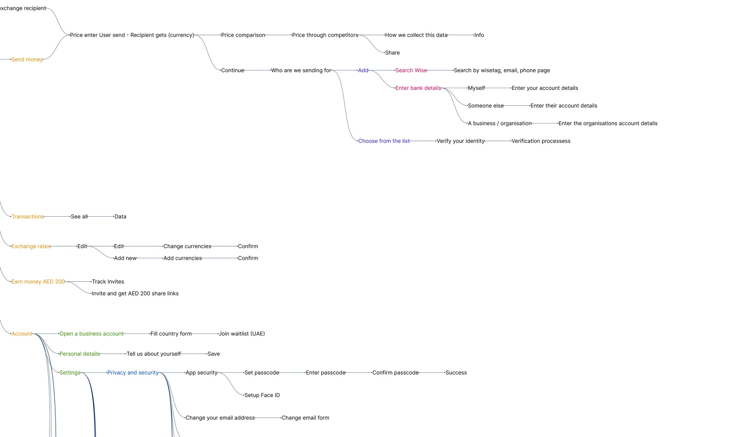
Before this project I had never used the Wise application, which was ideal for observing myself as a user. However, I was unable to complete my first transaction due to failed verification — my progress was halted there.
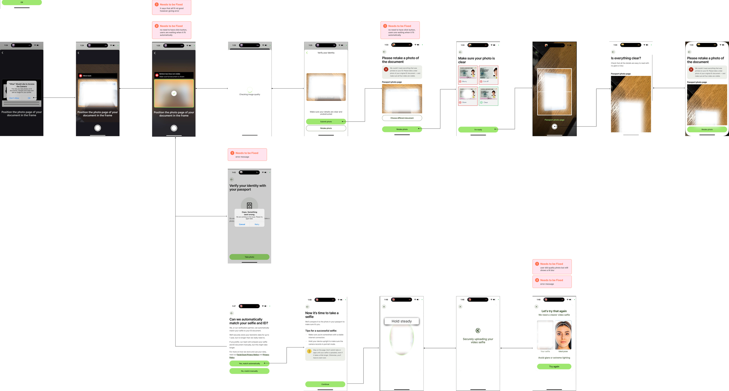
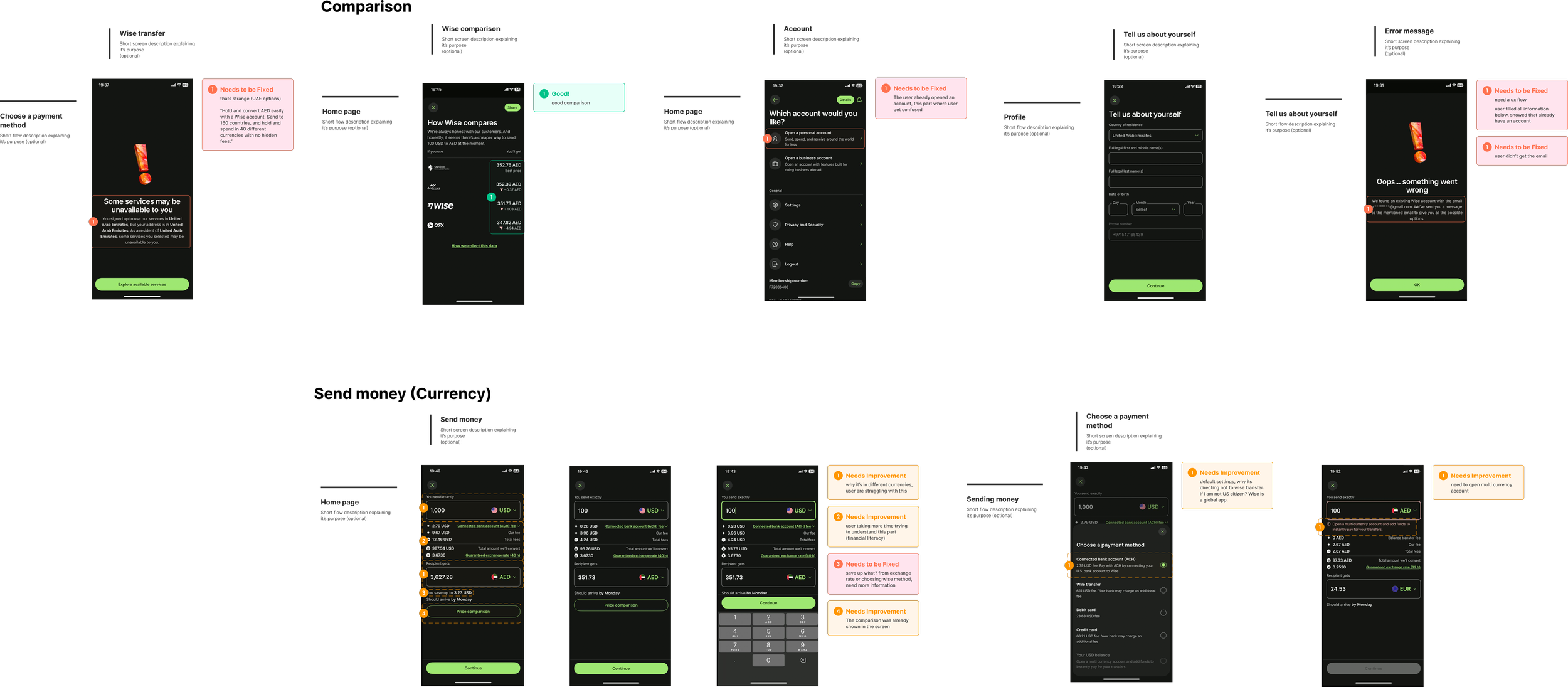
After going through all the steps, users still couldn't complete their first transfer — they encountered errors or unresponsive buttons. What if errors and verification incompleteness are one of the main reasons for low satisfaction? To go deeper I used open sources like mobbin.com to gather all the screens and complete a core flow, to understand at which funnel step users drop off.
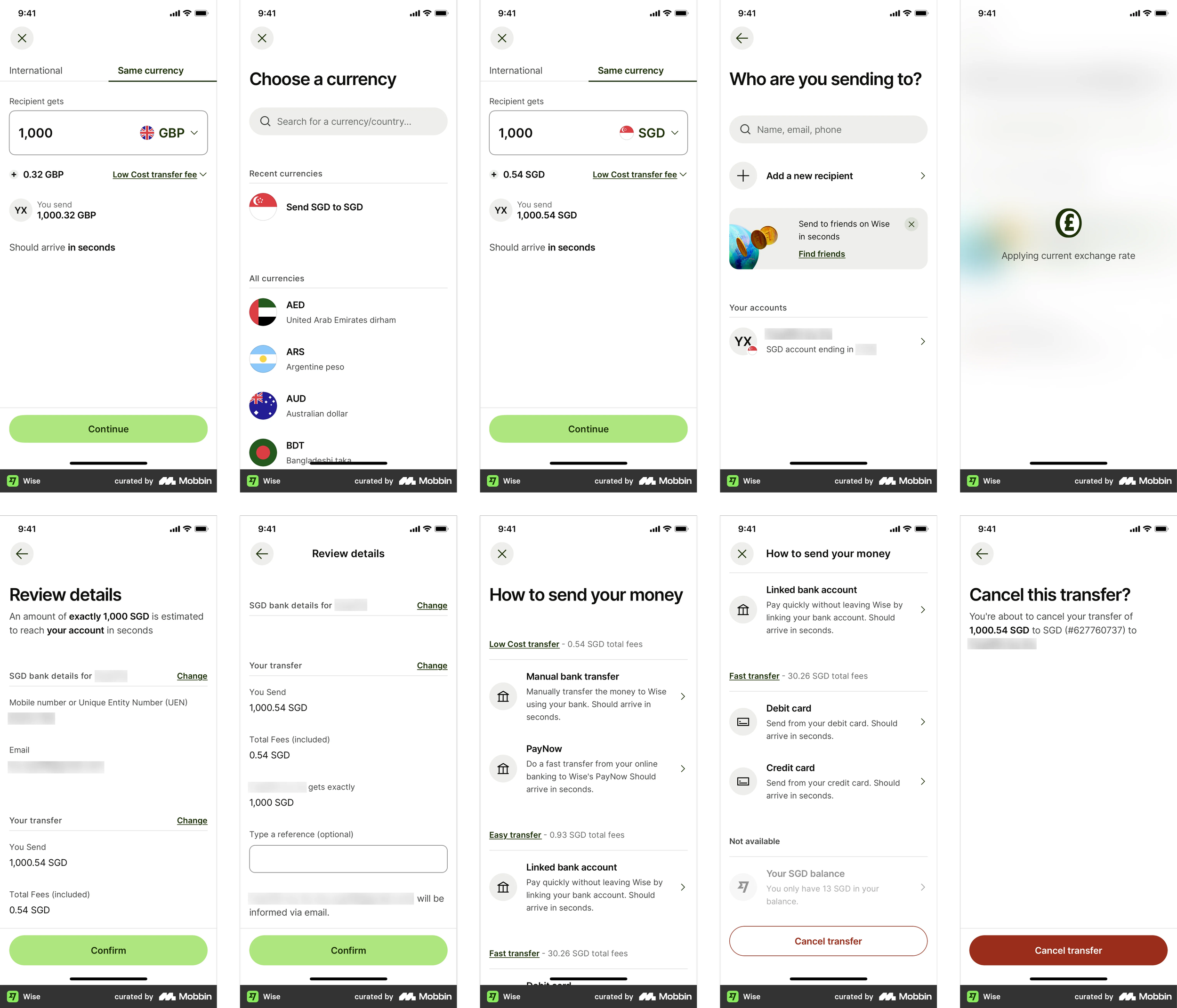
In the core flow we consider the “first transfer” as point A (sending money from the user's first debit card) to point B (their second debit card in the same currency and country).
Where do users drop off?
A funnel breaks the process into discrete steps, highlighting where users drop off.
A funnel is an effective way to visualise user flow because it breaks the process into discrete steps, highlighting where users drop off. This step-by-step analysis identifies specific pain points and bottlenecks, providing conversion metrics at each stage — enabling focused improvements on the most critical steps.
Quantitative data was gathered from 50 users of different backgrounds and ages.
- Login to account
- Select transfer option
- Enter transfer details (amount and currency)
- Add / select recipient (second card)
- Review transfer details
- Confirm transfer
- Transfer successful
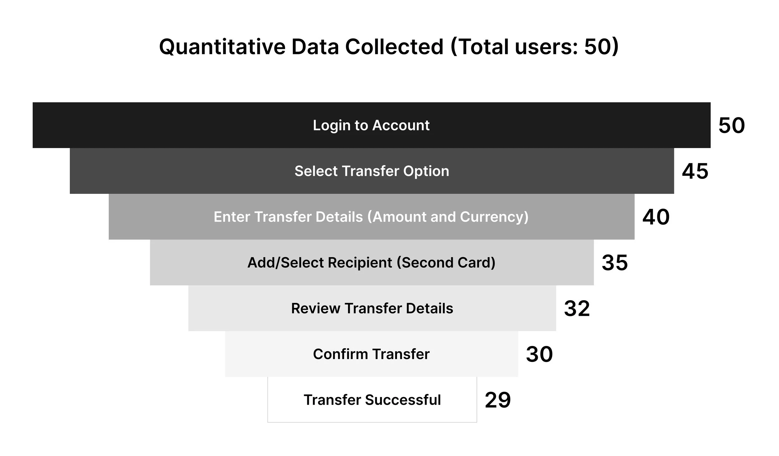
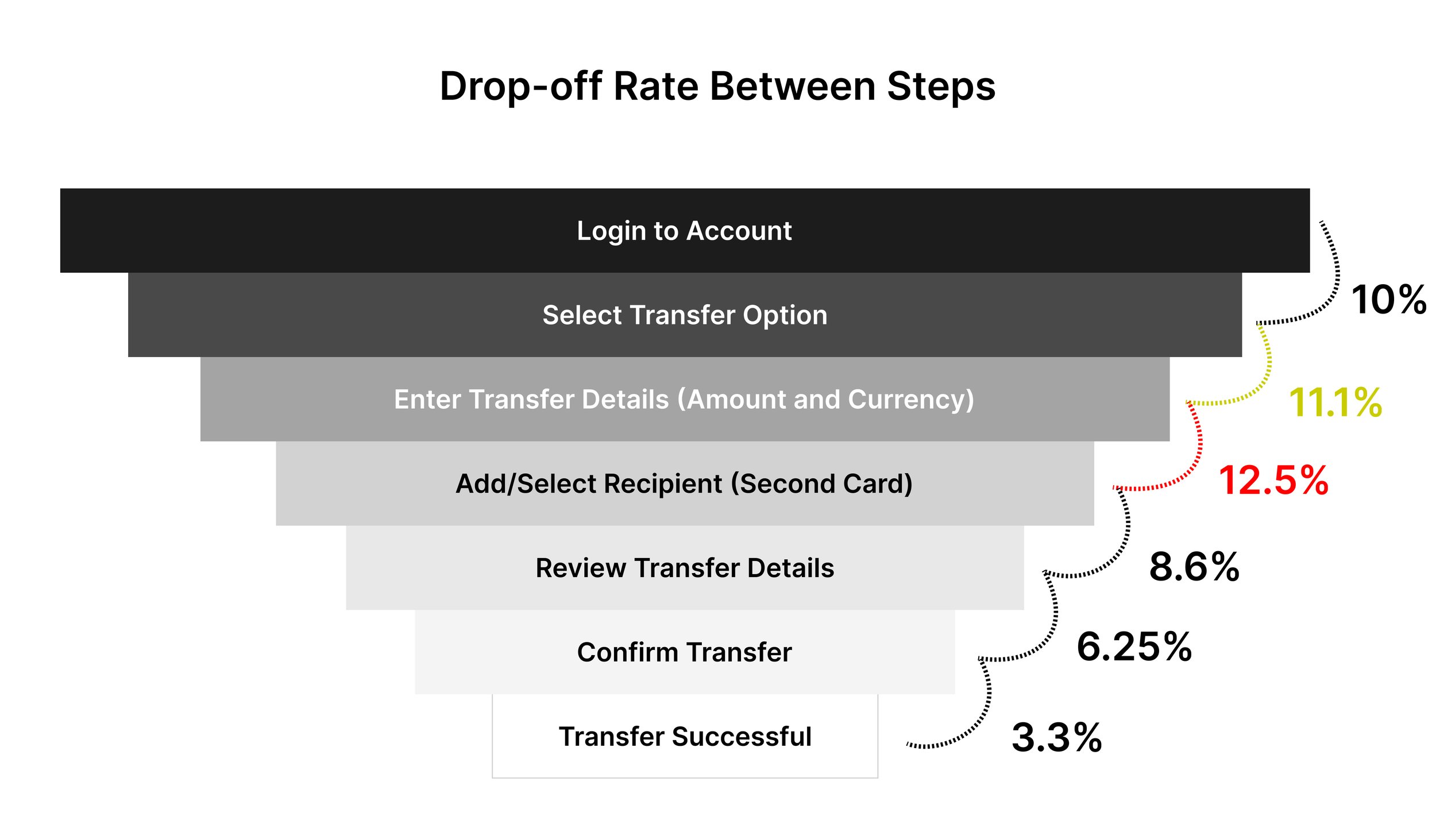
The highest drop-off (12.5%) occurs between entering transfer details and adding the recipient — a sign of complexity in managing recipient information.
The second highest drop-off is between selecting the transfer option and entering transfer details (11.1%), suggesting issues with the transfer form. Let's focus on the step with the highest drop-off — entering transfer details to adding a recipient (12.5%) — and run the UX ideation process to address it. I conducted qualitative research with multiple users to understand why this drop-off occurs.
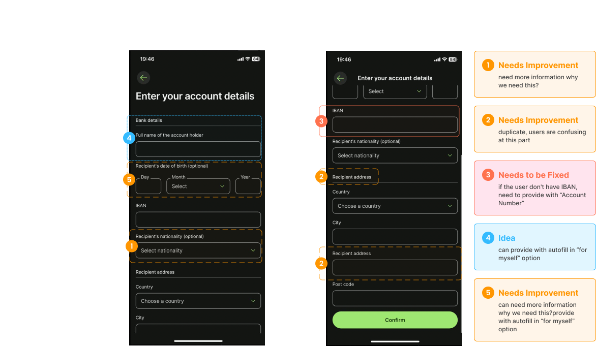
Prioritise high-value, low-effort fixes.
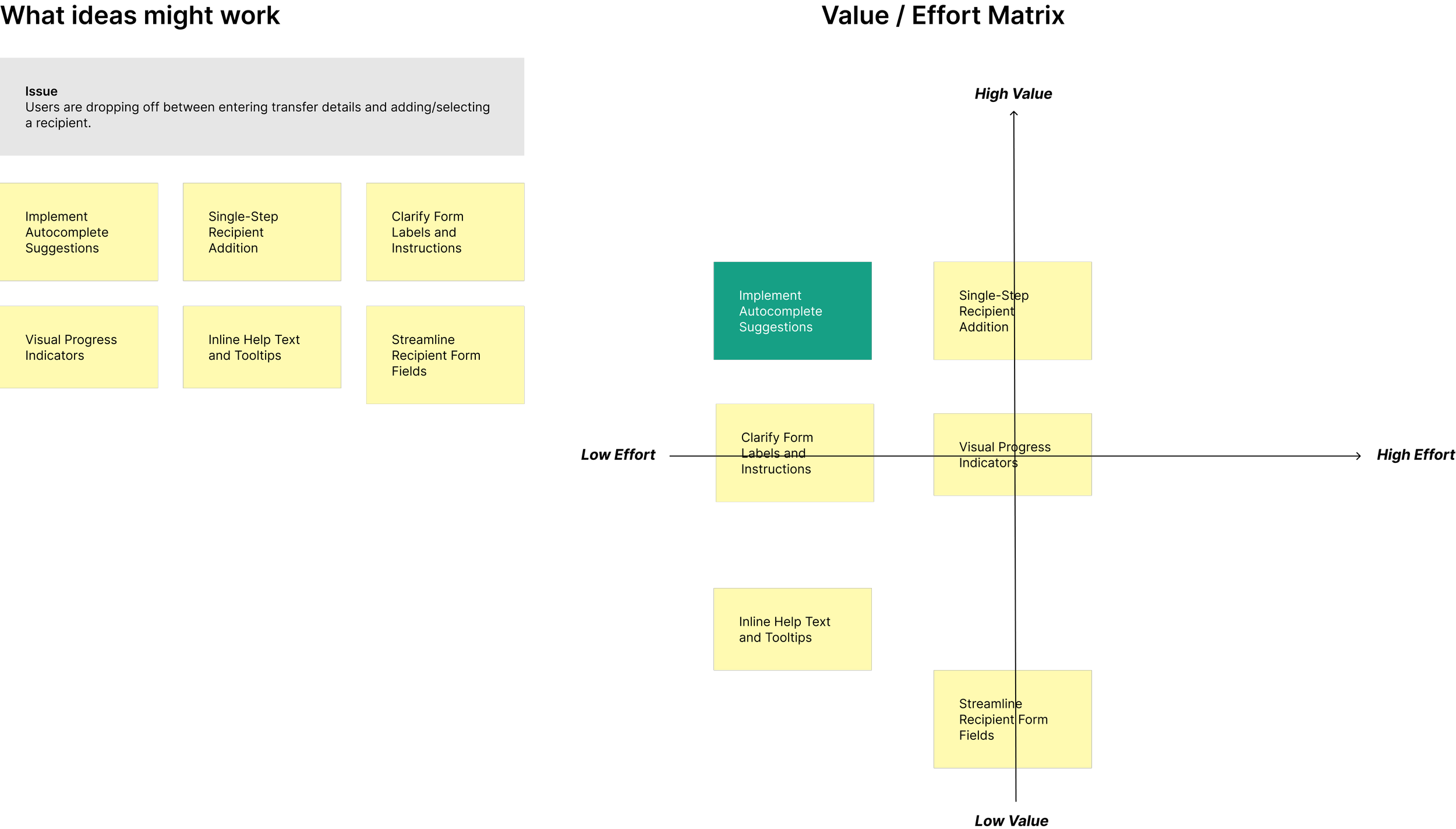
To address these challenges, the Value/Effort Matrix was applied to prioritise and strategise solutions. The implementation strategy focuses on prioritising high-value, low-effort solutions — such as autocomplete suggestions and single-step recipient addition — to deliver immediate improvements.
To streamline the process of adding new recipients on Wise, a user-friendly interface that guides users through each step efficiently is well-suited to this case:
- Develop a clear, structured form for adding recipients, ensuring all necessary fields are straightforward and easily accessible.
- Use progressive disclosure to initially display only essential fields, revealing additional fields (address, specific instructions) as needed — reducing clutter and cognitive load.
- Incorporate autocomplete in the recipient name field to suggest existing contacts or previously added recipients as users type, reducing duplication and errors.
- Implement smart defaults for common details (country, currency, account type) based on preferences or previous selections, minimising manual entry.
- Provide contextual help icons or tooltips next to each input field to offer guidance on what's required and how it should be formatted.
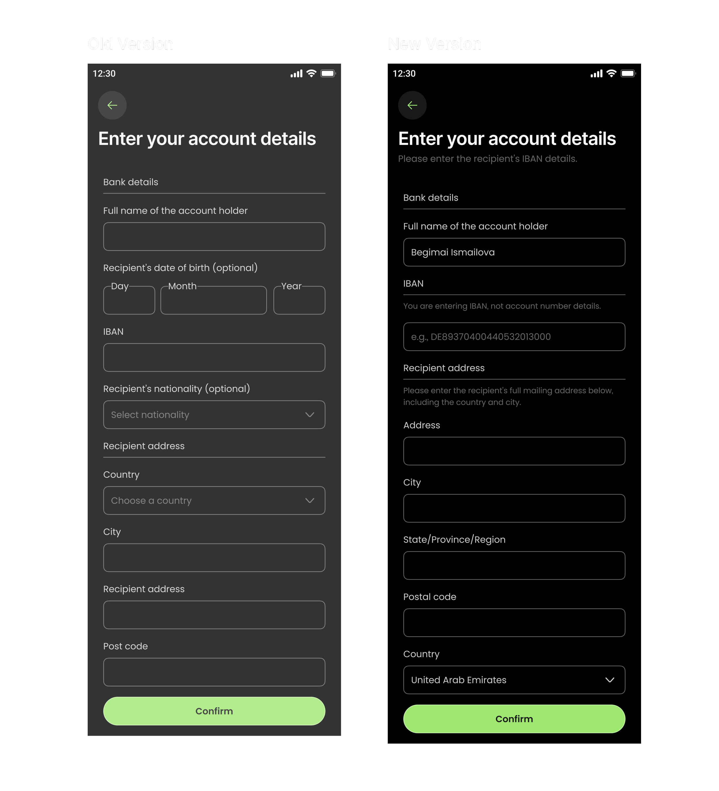
A faster, clearer, more reliable first transfer.
of users found the new form layout easier to understand and navigate.
reported the form felt less cluttered thanks to progressive disclosure.
reduction in errors related to duplicate or incorrect recipient details.
less time required to add a recipient via autocomplete suggestions.
used the contextual help on required information and formatting.
improvement in user retention — the platform felt easier and more reliable.
The structured form, progressive disclosure, autocomplete, smart defaults, and contextual help collectively contributed to higher completion rates, reduced errors, and increased satisfaction — underscoring a commitment to user-centered design and continuous product optimisation.