Enhancing Verification Experience Through User Interviews
“Every product that needs a manual is broken.” — Elon Musk
UX design focuses heavily on a deep understanding of users — what they need, what they value, their abilities, and their limitations. But in the banking applications of Kazakhstan and Kyrgyzstan, customers' needs and expectations aren't always a priority. I was part of the app design team focused on transfers and worked on redesigning the bank account verification team interfaces.
Kazakhstan's largest bank — a 35% market share, operating for over 99 years.
JSC Halyk Bank is the largest universal commercial bank of the Republic of Kazakhstan, which has been successfully operating for the benefit of its customers for over 99 years.
Halyk operates across retail, SME & corporate banking, insurance, leasing, brokerage and asset management, with branches in Georgia, Russia, Tajikistan, Uzbekistan and — where I worked — Kyrgyzstan.
Not only customers need UX design.
In every mobile banking application, customers verify their identity in several steps. Some parts are verified automatically; others are checked by employees — photo or video verification, where human checks are needed. They're called verifiers.
The verification page was built by a backend developer at Halyk Bank Kyrgyzstan. Missing the user research part — the first part of good UX design — backend developers concentrate on requirements, not on the user who interacts with the page. The aim was to create a user interface that could handle verification processing faster.
Today, users spend 5 minutes on average per verification — 360 minutes total across 72 completions.
Redesign the verification page
- Conduct user interviews with 6 people from the verification team.
- Design a new dashboard structure and navigation.
- User-test page prototypes on 3 people.
- With development, launch the website by August 29.
- Increase user satisfaction from 10% to 20%.
I was part of the app product team enhancing and innovating the UX for international-transfer interfaces. I supported the Bank Account Verification team, conducting research to identify issues using employee progress data and user feedback in the complex field of verification.
My research used qualitative data collection, a 5-stage process, probing techniques, behavioral research, and unmoderated methods: eye-tracking, click-tracking heat maps, time-to-task-completion indicators, and OKRs.
Key questions: Why does the page need to be redesigned? What are users' expectations of the page? What problems and challenges are users facing? Attitudinal research best fit the problem, since there are only 6 verifiers in the company.
Getting honest answers from six shy interviewees.
One challenge I faced was how users behave in the interview process. All the interviewees were Kyrgyz people who sometimes need support in decision-making. They were shy and unconfident with their answers because it was the first time they were being interviewed — some answers were different, which gave wrong data.
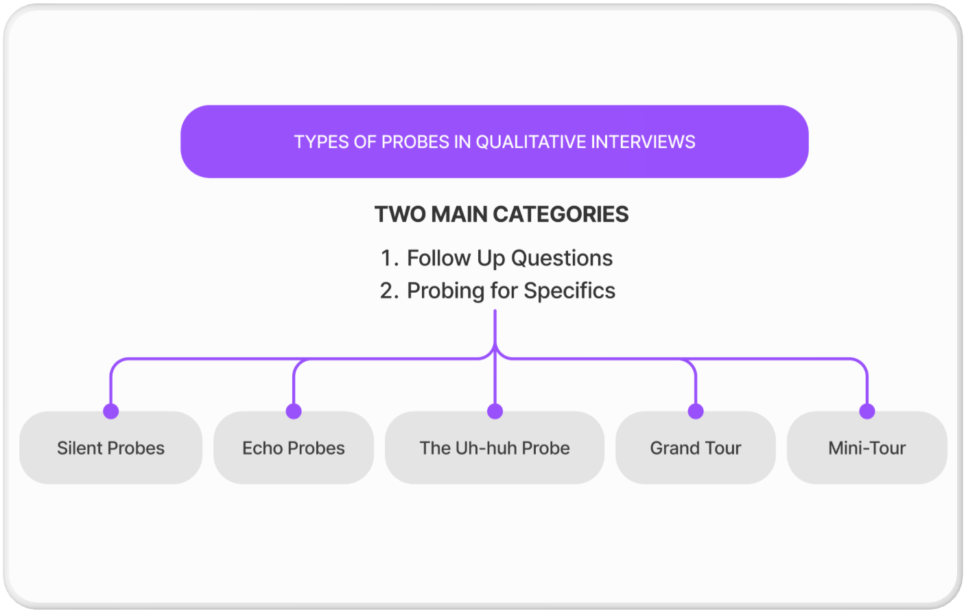
Probing is the key to a successful interview — and to honest insight.
One of the keys to a successful user interview is the ability to probe the interviewee when required. I always keep the probing techniques from Russell Bernard's “Research Methods in Anthropology” in mind whenever I go into an interview — they're simple, effective, and have worked every time.
I made sure to be myself during the interviews. These probing techniques served as drivers for the conversation, and the combination of active listening and interview probes guaranteed the time with participants was as rewarding for them as it was for me.
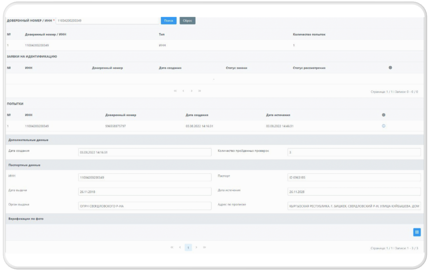
- Too much unnecessary account information — half of it is already verified by AI.
- Getting lost with buttons — not clearly understanding which button does what.
- If a verifier makes a mistake, there's no way to return — only with help from a backend developer.
- Too many steps: to accept, the verifier has to go back, find another application, and go forward.
- Colors — verifiers don't know which color means what.
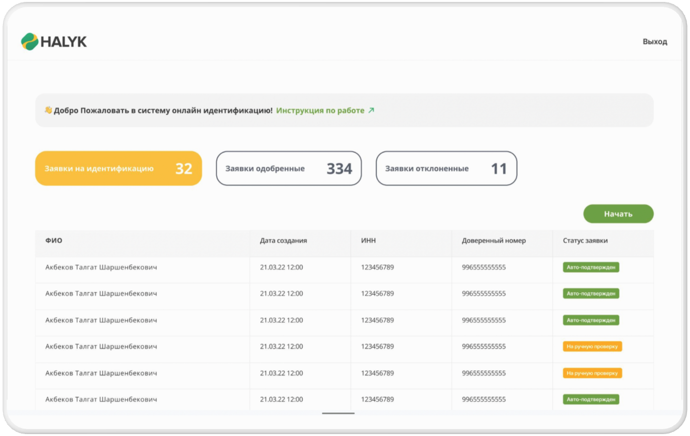
A clear, structured dashboard — verification in three minutes.
The redesigned interface is more intuitive, with a clear structure and guidance for each step of the verification process. Users find it easier to complete verification quickly and accurately, reducing frustration and abandonment.
processing time per user, through effective communication and high-quality designs.
average task completion time — down from 5 minutes per verification.
tasks completed in the same 360 minutes — up from 72 completions.