Non-intrusive ways to build profitability while safeguarding UX
Product designer at Careem, working across Discovery & Growth. I bring a business school foundation, a research habit, and a track record of product features that move both NPS and revenue.
In ride-hailing and super apps, the easy path to revenue is intrusion — pop-ups, ads, banners. I work on the harder path: monetizing inside moments the user is already in. Three projects, one pattern.
I work on the Platform team
We platformise every vertical into one design language and one set of patterns, so Careem feels like one app, not 22. Every feature I ship has to work across surfaces and verticals.
Helps users find the right service at the right moment. Routines, recommendations, post-trip surfaces, contextual nudges. Success = users coming back and going deeper into the super app.
Builds the surfaces that turn engagement into revenue — ads, cross-sell, lead gen, partnerships. Success = revenue per user, attach rate, conversion, without breaking trust.
One design language, one set of patterns across 22 verticals. Every placement I design has to hold up across surfaces and states, so new revenue never fragments the system.
Video ads on the post-transaction screen
Designing one of the highest-revenue ad formats in the post-transaction screen. Worked under my design manager's mentorship, in collaboration with the Activities squad, engineering, and the ads team.
The problem
The tracking screen is one of the most-viewed surfaces in the app. We wanted to bring video to it, since it's the highest-performing ad format in the industry on both engagement and revenue. The screen wasn't built to carry video, though — any monetised content had to live alongside trip information, not on top of it.
The tracking screen moves through six states: finding a captain, enroute, captain nearby, meet your captain, in transit, and almost there. Each state surfaces different information — car plate, ETA, route. The user's attention shifts state by state.
Video needs to appear across all states to deliver advertiser value, but the screen's primary content changes in importance throughout the trip. A fixed layout either drowns out essential info or wastes space on details the user already has. The real problem was content priority, not placement.
UX thinking & process
The video carousel stays consistent. What changes is what sits above it. For each state I asked one question: what is the user looking for right now, and how long will they keep looking for it?
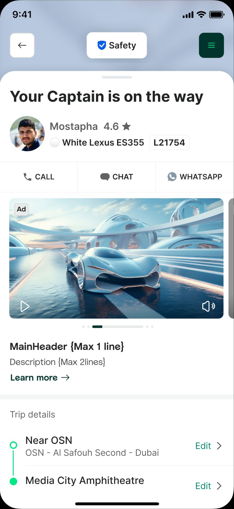
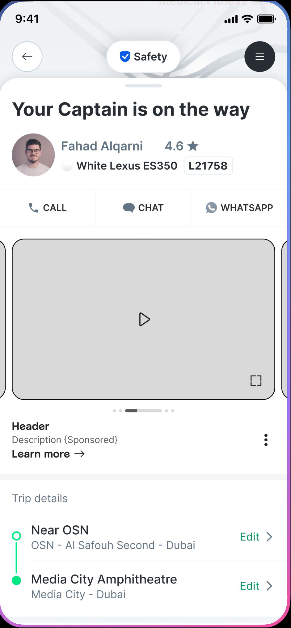
Final design — the video carousel holds a consistent slot while trip information takes priority by state. Built to IAB 1920×1080 with safe-space rules: muted autoplay, full-screen expand, sponsored tag, and report/hide controls.
Cross-functional work
The tracking screen is theirs. I aligned with them on what could shift and what had to stay protected.
Worked through autoplay rules, playback limits, and device performance.
Aligned video formats to IAB standards with safe-space rules so creative could adapt across our screens.
Placement per state was decided with the full system in the room, not just design.
Impact
- 35–40 new video campaigns booked
- ~$200,000 incremental ad revenue
- ~90% video completion rate
- ~+16% CTR vs static benchmark
- 100% viewability
- Live in 15 countries
- ~500,000 daily impressions
- Care contact rate: unchanged
In hindsight — what I'd change
One component, all surfaces, planned from day one.
The placement worked well on post-transaction, so the team extended it to other verticals. But the structure was tuned for that screen specifically, and on other surfaces a card-based version sat better — so we ended up building a second variant. That's the kind of fragmentation a Platform team should avoid. Next time I'd map every potential use case first, and ask the PM not "where does this ship first," but "where will this need to live eventually."
IAB standards from the start, not late in the process.
We aligned to IAB (1920×1080, with safe-space rules) before launch, but it happened late. Bringing that constraint in from the beginning would have shaped the placement's proportions more naturally and saved cycles on layout and creative handoff.
Brand lift studies via in-app lead gen
A lightweight Typeform surface that lets advertisers measure real brand lift on Careem. Lead product designer — I owned the entry surface, the full-screen flow, and the Typeform integration spec.
The problem
Advertisers could see impressions and clicks, but not the thing that justifies a brand budget: whether people who saw their ads thought or felt differently about the brand afterwards. Without that proof, brand budgets were hard to win and harder to renew. We needed to measure real perception lift — on a surface light enough to test the model before investing in custom infrastructure.
Careem users aren't on the app to answer surveys. They're between tasks, mid-flow, or just opened the app to do something specific — book a ride, order food, pick up groceries. Any surface that asks them a question is competing with their actual reason for being there.
A brand lift study only works if enough of the right people answer it, and answer honestly. Every extra question lowers completion, every wrong moment kills it entirely, and any sign that it's a third-party tool breaks trust. The problem was getting real signal from users who didn't sign up to give it, on a surface that still felt like Careem.
UX thinking
Two paths: build a custom survey system from day one, or use an existing tool and prove the model first. I argued for the second. Brand lift on Careem was unproven, and building infrastructure before knowing it worked meant shipping the wrong thing. Typeform let us validate the format with real users on real campaigns, fast.
We used components we already had — the same banner shape as our existing monetised placements, on the home surface that touches users across every vertical. Easy to ship, easy to compare against, easy to retire.
We tried two layout variants for the open window — one repeating the banner image at the top, one without. The version without was the better call. Header and description gave enough context, and the extra space let the Typeform feel like the focus, not a third-party widget pinned to a screen.
This is where most of the design work went. I went into Typeform directly, built sample forms, and mapped which settings could be customised: font, sizes, illustrations, color tokens. Then I built a spec for PM and engineers — which Careem tokens, illustrations, and type styles to use — so the embed would visually dissolve into the rest of the app.
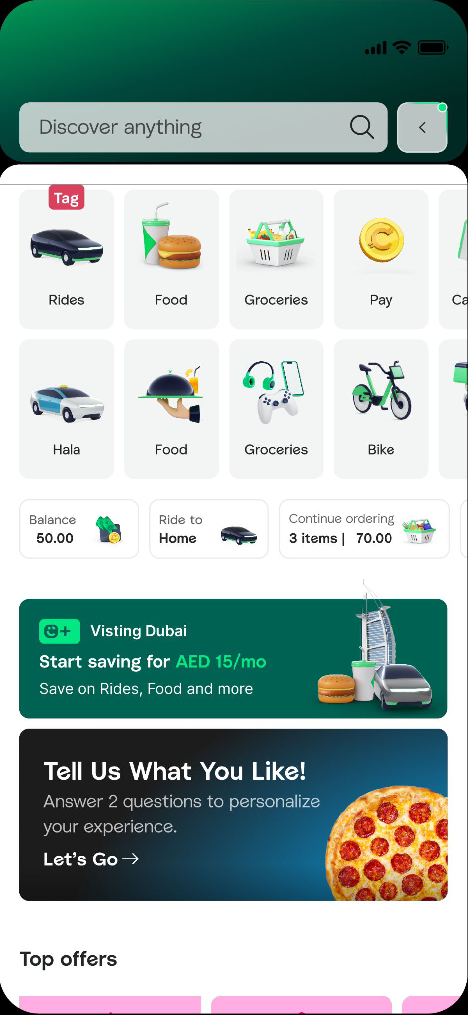
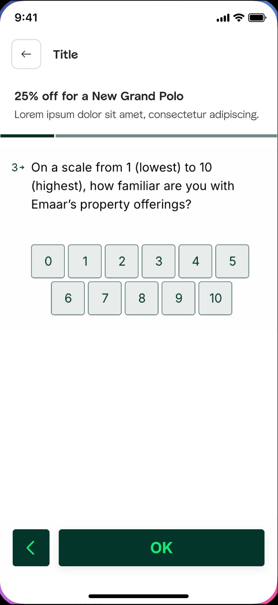
Anatomy — an entry banner on home discovery opens a full-screen window with header, description, progress bar, embedded Typeform, and CTA. One question per screen, tap-to-answer where possible, dismiss always visible.
Impact
- 4 brand lift studies completed
- 4 advertiser campaigns included lift
- +30% incremental brand ad revenue
- Live in 3 markets
- 1.7M users exposed
- 4 studies served
- 0 repeat-exposure complaints
Map pin + crown banner
A dedicated ad placement for the rider icon to maximise platform revenue without disrupting UX. Lead product designer across both phases — I owned the placement design and cross-squad alignment with Activities on the crown banner.
The problem
The carousel on the post-transaction screen runs multiple campaigns in rotation. That fills inventory, but it has limits: no single advertiser gets 100% of impressions, attention is split, and big brands won't pay premium rates for a slot they share with three others. We needed inventory that could be sold as a roadblock — one advertiser, full visibility, premium price — without crowding the screen further.
The post-transaction screen is one of the most-viewed surfaces in the app. The user is watching their order or ride progress, glancing back and forth as the state updates. Whatever we add here has to live alongside what the user came to check, not on top of it.
Premium inventory has to feel premium without feeling intrusive. The map pin sits on the only piece of real-time information on the screen, and the crown banner shares space with a component the user has learnt means urgent news. The problem wasn't "where can we add ads," it was "where can we add ads valuable enough to justify a premium price, without breaking the trust the screen has earned."
UX thinking — a two-phase problem
Phase 1 was a branded map pin replacing the standard vehicle icon, paired with the existing carousel banner — one advertiser, two anchored placements. Phase 2 came from a real shipping problem: the carousel banner isn't visible in every state, so users would sometimes see a branded map pin with no connected ad context. That broke the logic. We needed a second, more stable connector.
I studied how other super apps handle the same problem. Grab solves it with a branded map pin and a small banner pinned below the map. Their version works, but it sits on top of Google Maps and we couldn't follow the same restriction rule. We needed a placement that lived outside the map area but stayed close enough to feel connected.
Instead of designing a new component, we reused the crown banner — the green pill-shaped component normally used for urgent updates like item replacements and order delays. It already had the right visual weight, anchoring, and hierarchy in the user's mind. Reusing it kept delivery fast and avoided fragmenting the system.
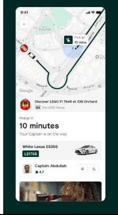
The branded map pin paired with the reused crown banner — one advertiser, full visibility, anchored to live map information.
State logic
The crown banner can't always be on. We worked through every state and aligned on a clear priority order:
The principle: urgent news always wins, and ads only run while the map is doing its job.
The crown banner lives in Activities squad's design ownership, not Growth's — so the second half of phase 2 was alignment, not design. I worked with the Activities designer on a single variant: same component layout, swap the timer for an "Ad" badge, no other changes. That kept their system intact and got us through review fast. We then ran workshops with both squads' PMs to lock the state priority rules.
Impact — projected
- Sold as a roadblock
- 100% utilisation expected
- Cost-per-day campaign model
- Live in 2 markets (KSA, UAE)
- GTM in progress
- One advertiser, full visibility
- Anchored to live map info
- No new surface area added
Three projects, one approach.
Across all three, I worked the same way. Every placement attached to a moment the user was already in, instead of asking for new attention. Each one leaned on a component or surface that already existed, so new revenue didn't add new surface area. Every project shipped with a business metric and a UX guardrail tied to it, because revenue and trust have to live on the same scoreboard. And each placement was designed to work across verticals and states, because monetisation only scales when the system stays coherent.
Non-intrusive monetisation isn't the soft option. It's the only way to grow revenue without losing the users who pay for it.
I start with the system, not the screen.
Before I draw, I want to know what surfaces a feature will touch, what owns those surfaces, and what's already there I can reuse.
I bring PMs and engineers in early.
Not to validate, but because the best design decisions usually come from someone outside design pointing out something I missed.
I think in trade-offs, not preferences.
Every design choice loses something. I'd rather name the trade-off out loud than pretend a decision is universally better.
I read data the same way I read mockups.
A business case isn't separate from a design case; they're the same case, told two ways. The hardest part of design is knowing which one is which.
I push back when it matters and let go when it doesn't.
The hardest part of design is knowing which one is which.